Logo and branding for Sigma

Sigma is a company that is aiming to not only develop cool boardgames, but also support people who would like to learn how to create boardgames.
They were in need of a logo and branding and since I am an avid boardgamer myself, I was only too happy to help them out with this.
1 month
Duration
Sole designer
Role
SIGMA AB
Company
Problem
I had many chats with the founder to see what they were after. When describing their mission and values, it became clear that they valued growth, commnunity, connection, fun but also networking. The networking part was particularly interesting, since I helped me to understand the business side of boardgame development.
We agreed that I would focus on the logo first, but that branding colours would be most welcome as well to round it all out.
Discovery
I started to checkout the types of logos the founder liked most and based on his insights I summarised it all in a persona for future reference.

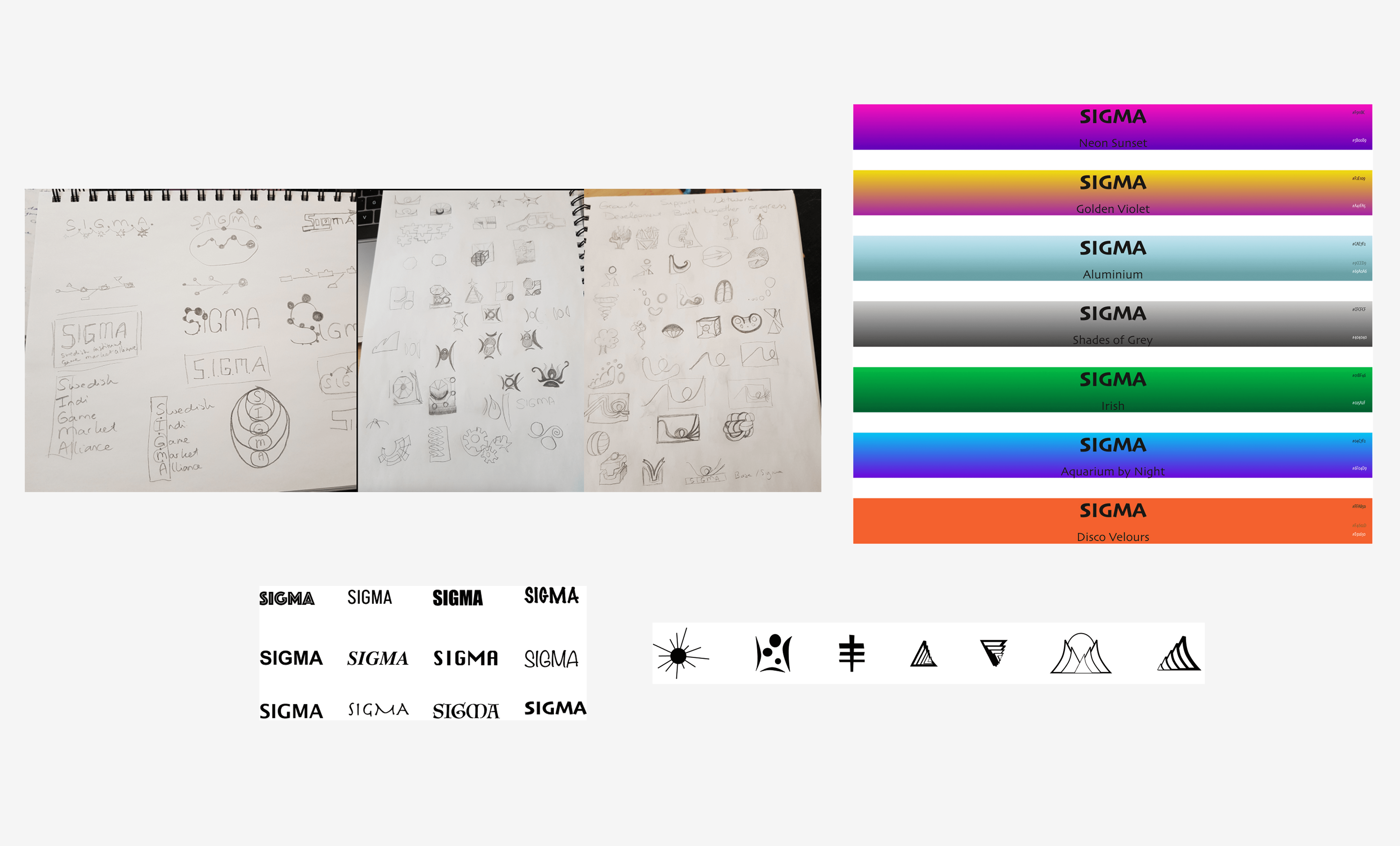
Iterations
During the iteration phase I had fun with wild sketching with pencil and paper, just to get the creativity going. I also started to create more high-fidelity compositions and colour combinations. I stayed in close contact with the founder to see in which direction we wanted to keep going.
Solution
The final solution embodies the original identified terms: growth, commnunity, connection, fun and networking in a satsifying way. The colours we ended up with was a combination of the warm orange that is inviting, with a splash of yellow for creativity and red for passion. All important things when it comes to boardgaming.
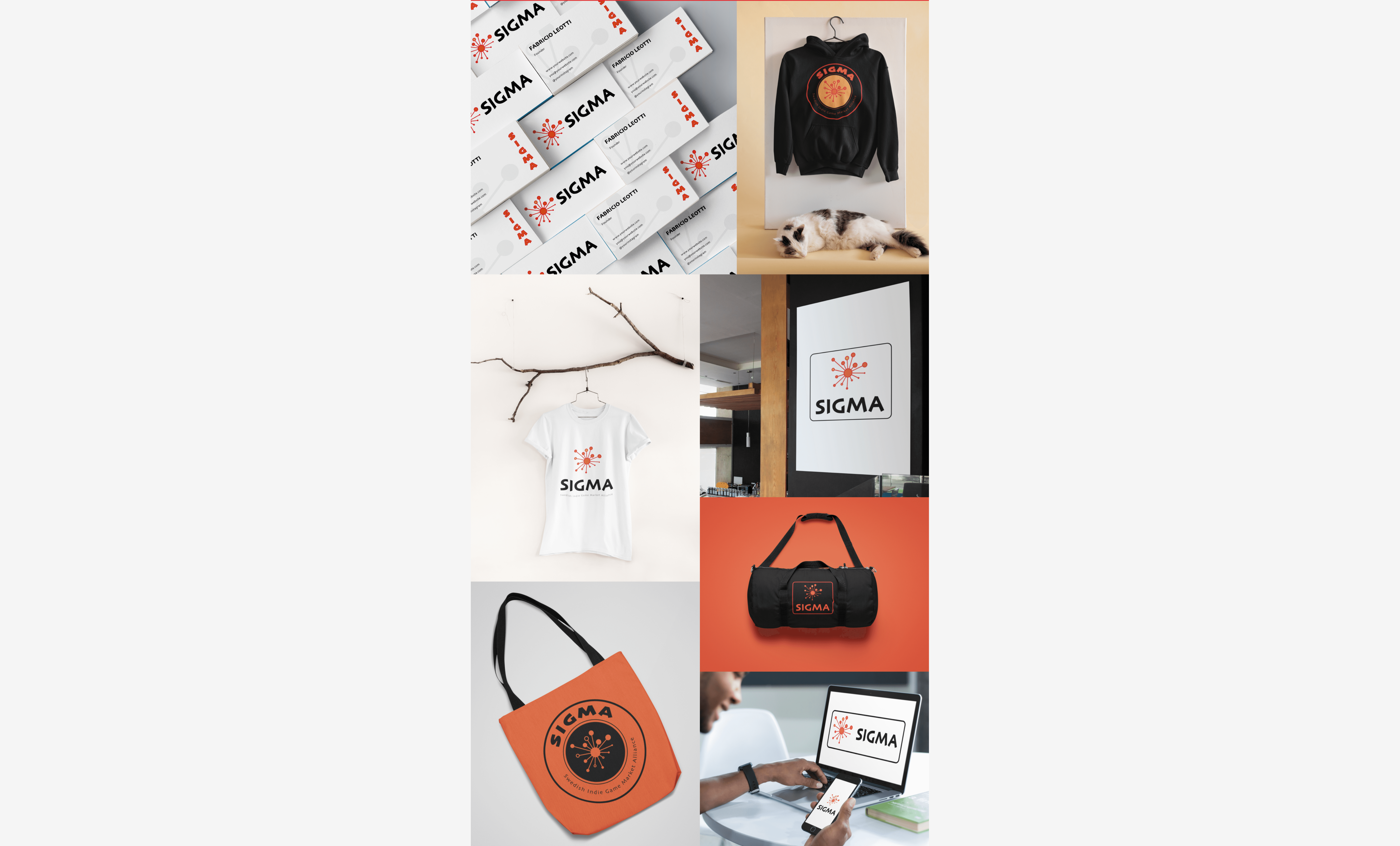
I also created real life mock-ups for the founder so he could see the logo "out in the wild" in case he wanted to create merchandise. It was also important to see a mock-up of the logo on a boardgaming box (of course).


