Live data insights to boost performance

+ 4%
KPI performance
+ 1%
CSAT increase
Providing insights in all the important KPIs for 5k Customer Support users
The Customer Support agents were in need of seeing live data across their channels to monitor their own performance against the company's KPIs and their development goals.
4 months
Duration
Main designer in crossfunctional team
Role
Klarna AB
Company
Problem
Customer Support agents received data around their performance, but it was a highly manual task for their managers to collect and share this data. It was therefore only shared once a week via email, meaning the agents only had access to outdated data. Besides the infrequency, they also could not see performance over time since no historical data was shared with them.

Discovery
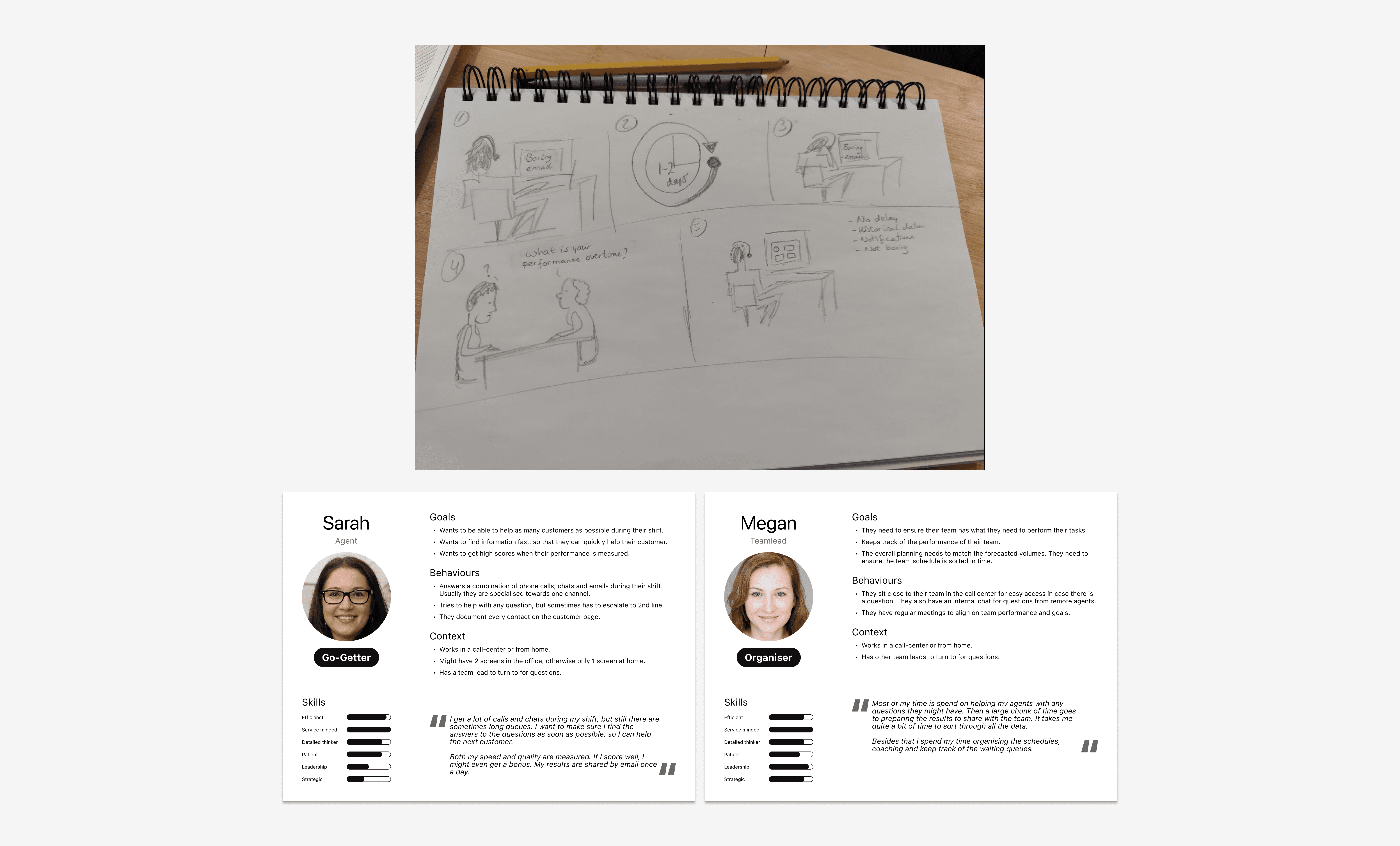
I set up two focus groups, one with Customer Support managers and one with agents to collect feedback on the current experience. Thanks to those sessions I learned about the highly manual and slow process of sharing snapshot data. To increase empathy with existing customer experiences I like to sketch out the scenario. I also summarised my insights into two personas, which I could reference throughout the work.
Since dashboards are "a plenty", I checked different patterns to see what common expectations exist for dashboards.

Iterations
The iterations went hand-in-hand with the technical discovery to see what live data we were able to display to the agents and teamleads. With different high fidelity designs I also performed moderated usability tests and general feedback sessions with the focus groups to validate designs.
The main feedback I received during those sessions was that they would like one overall number or metric to check-in with. Agents also mentioned they had two goals with this dashboard. On the one hand they wanted to be able to check-in quickly between customer contacts. On the other hand they wanted to deep dive into the longer term trends during their performance review talks that happened quarterly. This meant that the visual hierarchy was of great importance to allow for a quick check-in, but that drilling down into the data was equally important to track performance.


Solution
The final solution had to cater for all main company KPIs, but I did manage to get an overall performance score in. So if the agent just wanted a quick check-in, they only had to look at the one number.
In the overall roll-out I helped determine how we would go live and helped craft the communication plan to introduce this change. It was not possible to go live with everything at once. The PM and I didn't want to wait either until everything was done, since each live data point was already an improvement from what was live today. Thereofore each section or 'card' as we called them, had several release milestones. When something wasn't live or supported yet, I ensured a "coming soon" section was implemented to create some buzz for upcoming functionality.


Learnings
Data visualisation is challenging in itself, but the complexity was increased because we had to work with data from different sources which had variating refresh rates. Also empty states were extremely important to handle well, so as to not discourage agents when they did not have a lot of data to go on. Both of these learnings resulted in detailed components that could handle many different states and data "freshness" indicators.
If I could do it all over again I would get an earlier understanding of what was possible from a data perspective as early as possible. In this project we had both streams (design and data mining) running in parallel which resulted in surprises along the way.


