Migration of 5k users to support 2M Questions

84% globally
CSAT score
90%
SLA score
When time is of the essence, an effective system is all that matters
With 5k agents handling over 2M million questions per month, the system in which they need to work needs to be high class. I designed the full platform end-to-end, embedded in a cross functional team with a PM and engineers. This project had a lot of facets, but the main framework was designed in about 2 months. Once that was done, many other features were easy to add thanks to the scalable solution I designed.
2 months
Duration
Main designer in crossfunctional team
Role
Klarna AB
Company
Problem
Klarna had a Customer Support (CS) system in place, but it was due an update. However, it was in such a state that the decision was made by management to rebuild the system from scratch. This meant we had a do-over. That also meant we had to think about a migration path from the old to the new system for all our users.
Discovery
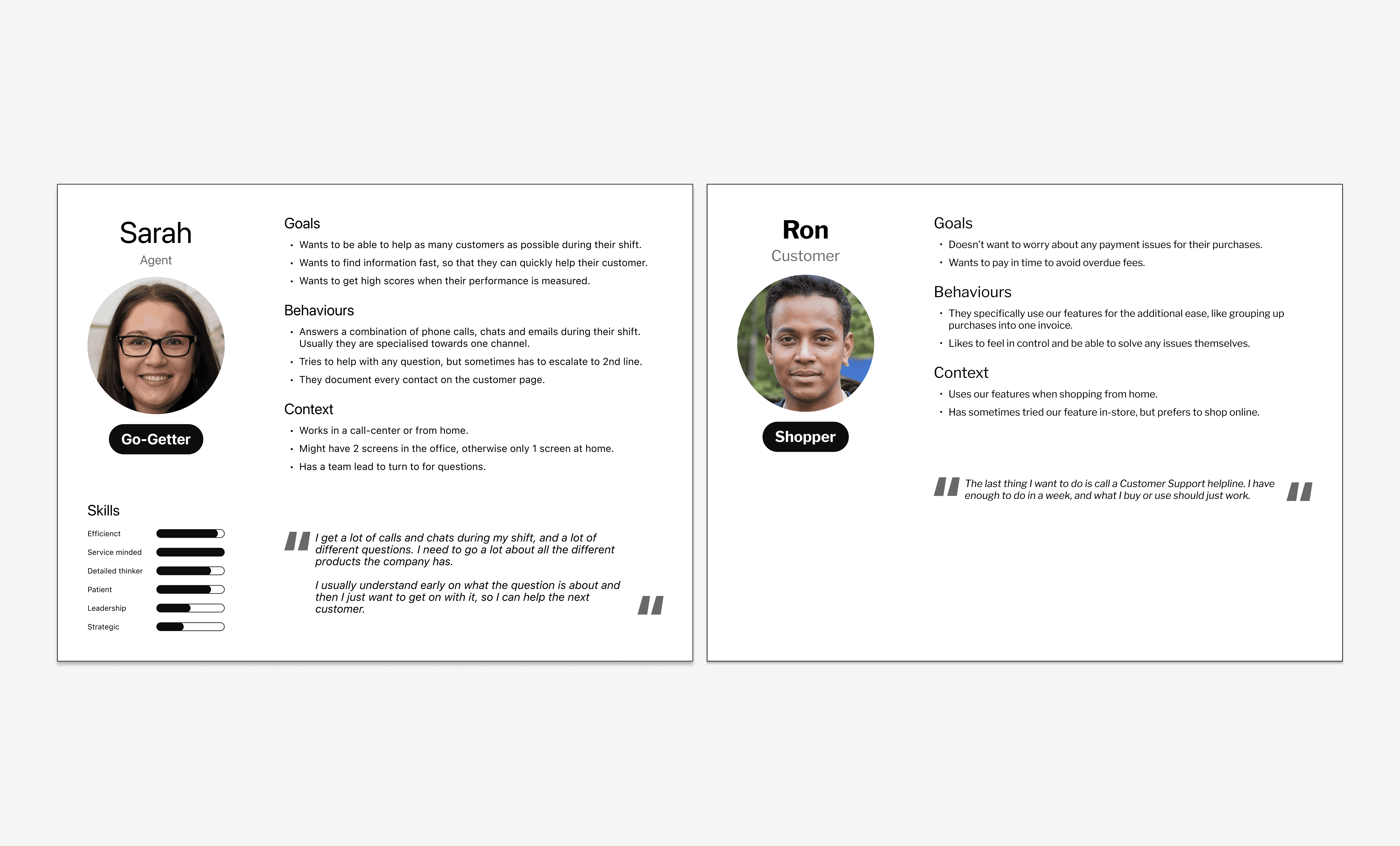
With the benefit of already having a system in place, I was able to assess it and take all the learnings into the new platform. Through user interviews, shadowing agents and analytics I was able to identify issues like: - Highly manual tasks still existed for frequent issues. - There was a suboptimal information architecture and visual hierarchy, making it hard and slow to find things. - It was impossible to see a good overview of the customer and all their products.

Iterations
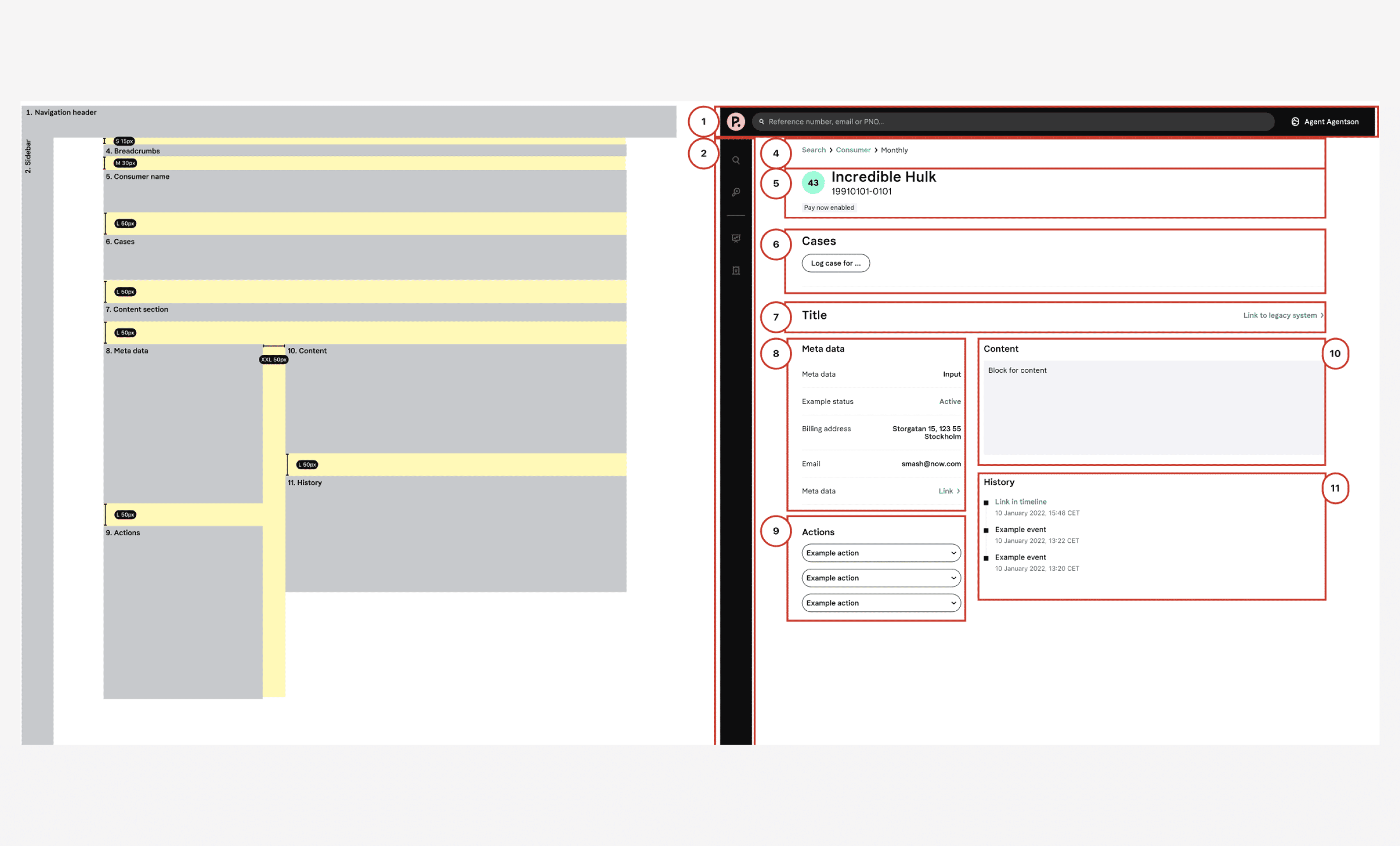
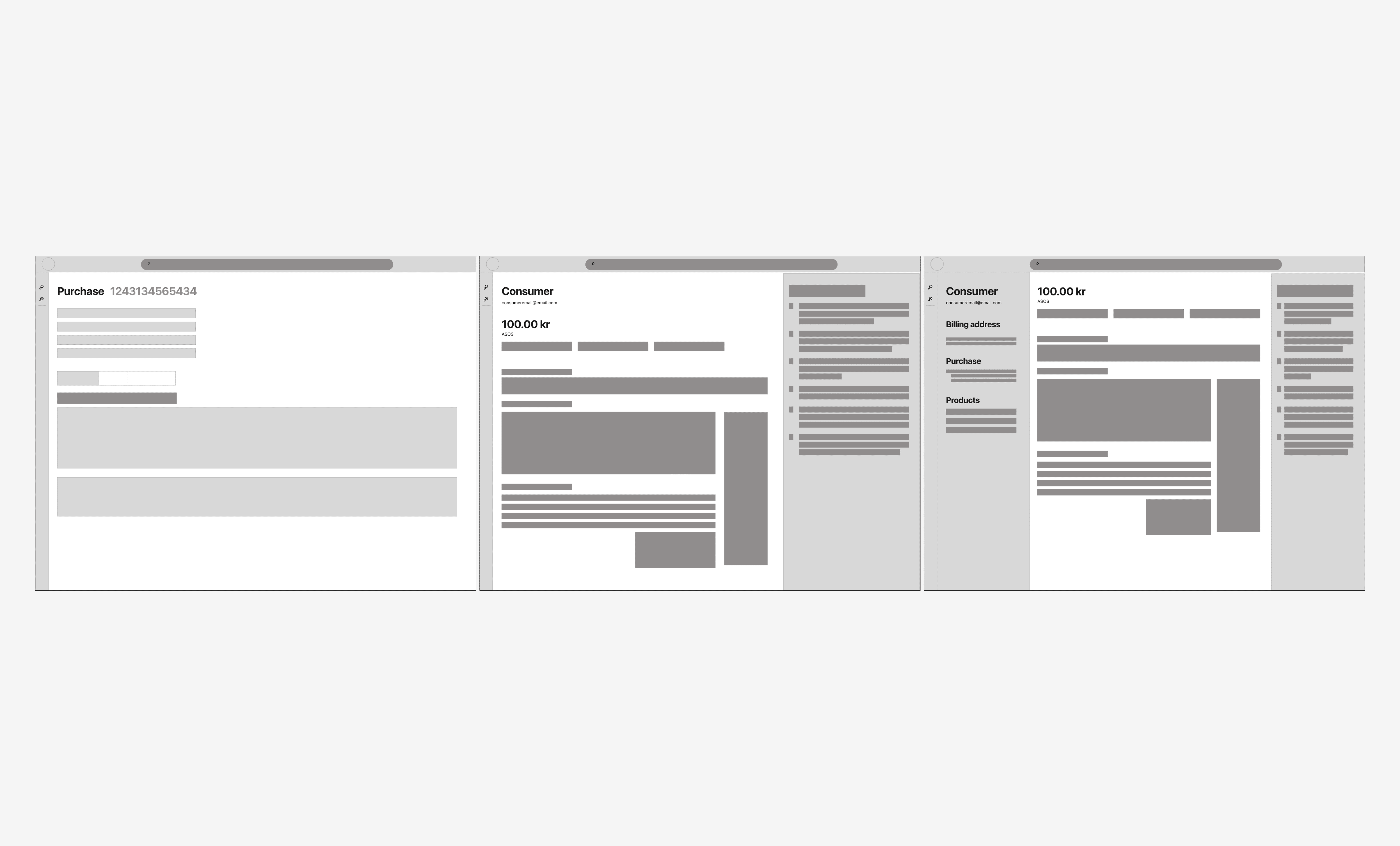
The main focus of this project was to create a scalable framework that was efficient to work with. Therefore visual consistency across pages was key, together with room to grow. So no matter how many products Klarna would end up launching, the platform could handle it.
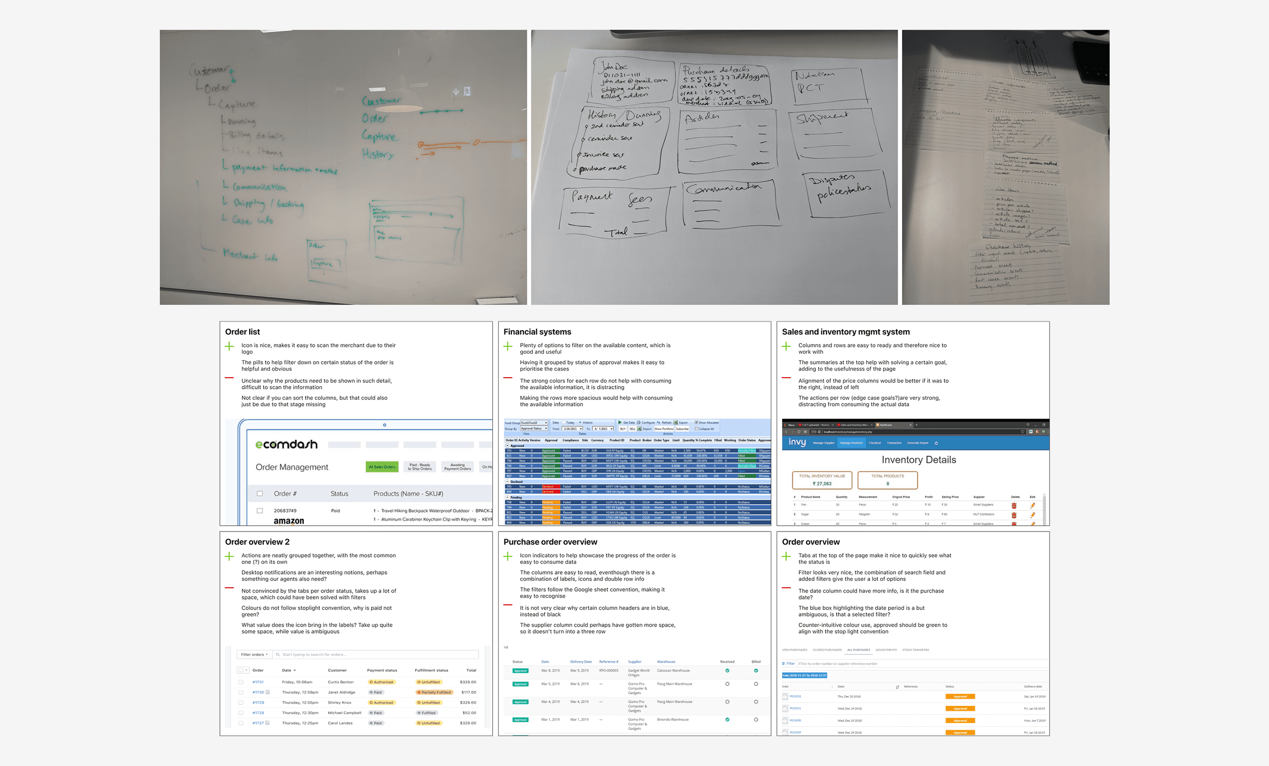
During the iteration phase I created several wireframes and mid-fi designs to get feedback from our users. When asking for feedback I focussed on performed moderated usability tests. This would allow me to see how successful a user was in completing a task, instead of listening to feedback that had a high risk of introducing bias. Since the old system was not the prettiest, feedback was often quite biased towards the new designs. So I tried to filter that out as much as possible and just focus on task completion rates.

Solution
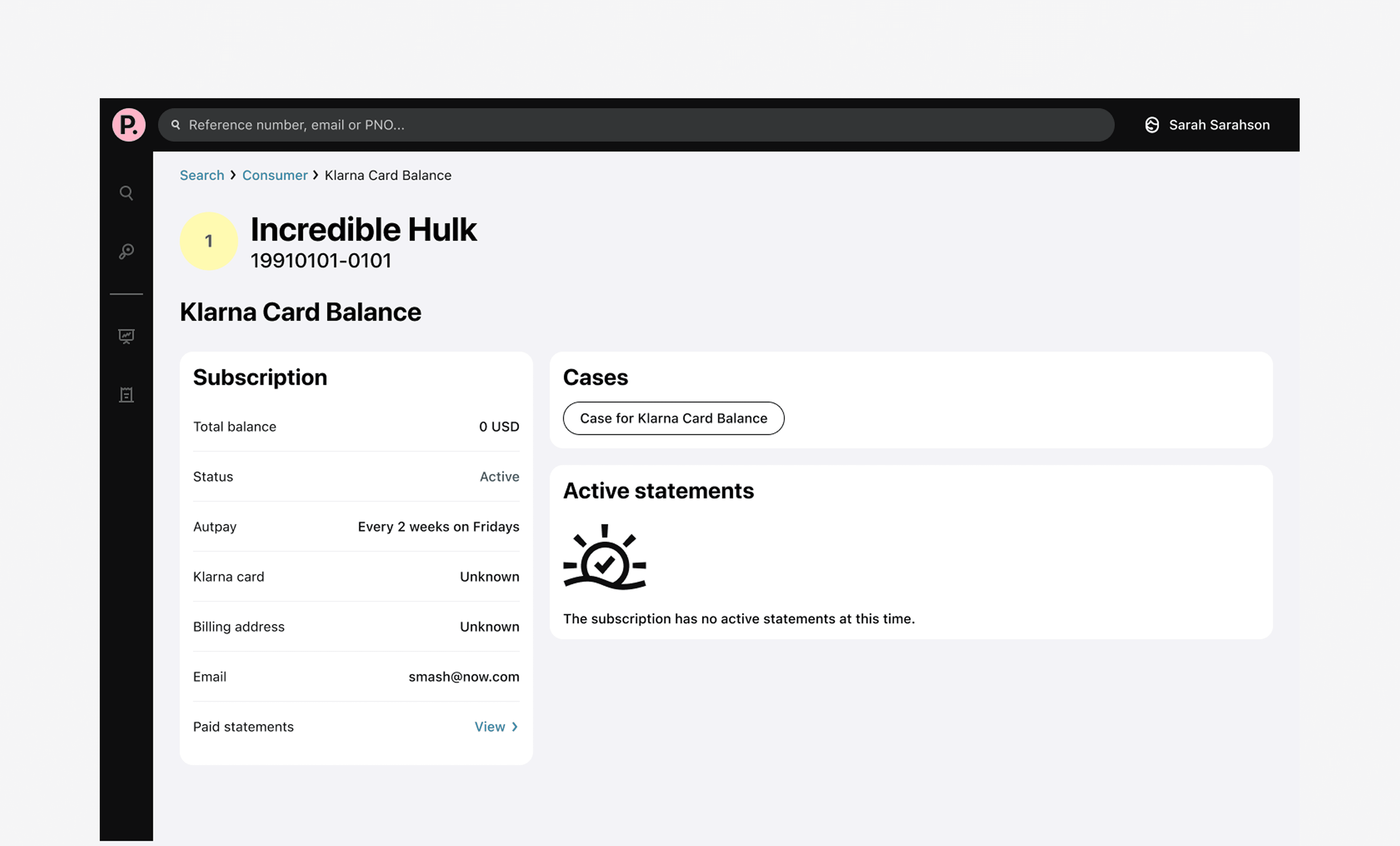
The final solution was a framework that was designed for scale. Any page would always have the same elements in the same place. Things like meta data, actions, administrative tasks could all be found in a similar spot across pages. Another improvement was the clear header with the customer name under the page title.
Chat agents in particular worked with several chats at once, making it extra important that it was very clear which customer they were viewing at any time. I also reduced the amount of pop-ups or overlays, because the users preferred a denser UI over additional clicking around.
Learnings
It is easy to get lost in the details, which can be distracting if you need to figure out an overall framework. However, it is good to test with real data to validate the design assumptions and see if everything is working as expected. In those testing moments, details do matter.
Next steps
Once the platform framework was created I collaborated closely with other product teams and their designers to integrate more products into the new platform. I also was closely involved in the migration, communicating and educating our users on what functions should be done in the new platform and which in the old. We aimed to keep the disruption as small as possible for the day-to-day of our users, trying to migrate as many tasks as possible in one go.

